Contents
Variable width bar graphs using Veusz
Background and rationale
Variable width bar graphs (or column charts) are used in various technical disciplines. Currently Veusz does not directly facilitate such graphs. However, this can be achieved using XY plotters to draw rectangles of variable height and width, either a single rectangle or a series of rectangles with the same properties/formating (such as line and fill colour) for each data category.
Normally, the data for a variable width bar graph consists of three vectors, entry (category), height and width. Converting these to vectors for plotting the x-y traces for each entry could be done in a spreadsheet, but adding each manually to an XY plotter in Veusz could be a bit tedious if there are more than a few entries. This is best achieved programmatically, and here R has been used for this task; conversion of the raw data and the generation of the initial Veusz plot for subsequent customisation.
Others describe methods to do this using spreadsheet graphs (e.g., Peltier 20091, Schwabish 20152), however these are relative complex and are not easily automated. Labelling the graphs in these examples is particularly awkward. So a method using R and Veusz seems to be an easier and more flexible alternative. Of course, this can be done in R directly (using barplot(heights, widths) or R packages, ggplot or mekko and the like), however, this does not come with the convince provided by Veusz. Ideally, it should be done with a Python script integrated into Veusz, but this is my solution for now.
Procedure
Provide source data in standard Veusz format in a file named varBars.data.txt, as shown below. The entries do not need to be sorted by height and there can multiple entries per category. The category names must follow Python naming rules, so no spaces or prohibited symbols (however, the R code replaces the operators, +, -, / and *, with tildes). Commonly underscores would be used to replace spaces, but Veusz uses these to start subscripting in text elements, so '.' could be used (see the genome example below where this was done).
descriptor entry height width
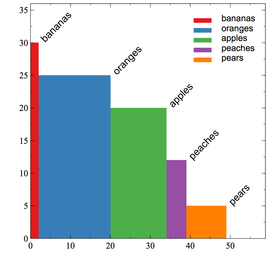
apples 20 14
oranges 25 18
peaches 12 5
pears 5 10
bananas 30 2
Run the R code ensuring that varBars.data.txt is in working directory, or use setwd() to point to the appropriate location. The code will create two files, varBars.txt and varBars.vsz.
varBars.txt: The first dataset in the file is the left, centre, right, top and bottom coordinates of the first bar for each category. The subsequent datasets are the x-y coordinates for each category (which may represent more than one bar per category if multiple entries per category are included). For the above example data, varBars.txt will contain the following.
descriptor entries left center right top bottom
bananas 0 1 2 30 0
oranges 2 11 20 25 0
apples 20 27 34 20 0
peaches 34 36.5 39 12 0
pears 39 44 49 5 0

descriptor x_bananas y_bananas
0 0
0 30
2 30
2 0

...[and so on for the four other categories]
varBars.vsz: This file is the code to generate the initial graph in Veusz. It consists of a single graph with labels, category XY plotters and a key.
Open varBars.vsz in Veusz and modify as needed.
Probably only one form of labelling will be required, so either the labels or the key can be hidden or deleted. The position of the labels can be changed using the three x and two y data vectors ('left', 'centre', 'right', 'top' and 'bottom') and changing the rotation to suit. Axis labels will need to be added and lengths adjusted. In the initial graph, the axis lengths have been extended to accommodate the diagonal labels. Also, the aspect ratio might need to be altered if there are many entries (see the genome example below).
Examples
Fruit

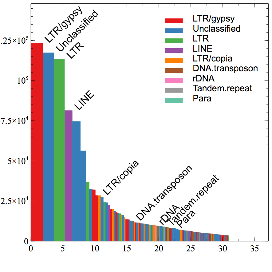
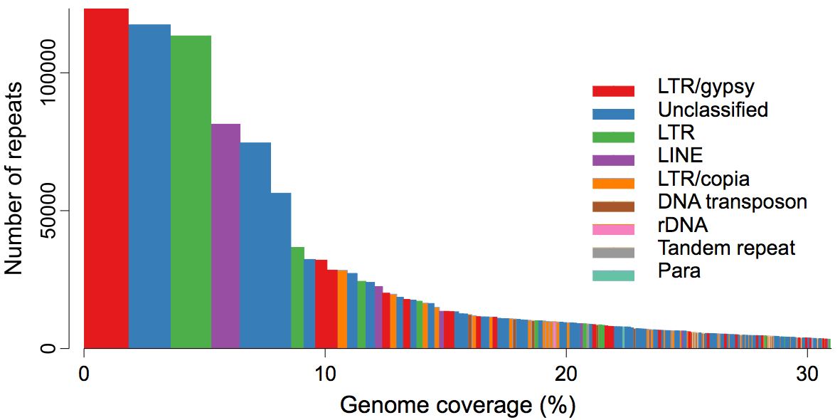
Genome repeats
Initial - varBars.genome.vsz

Edited - varBars.genome.edited.vsz

Note: in this case the category names included characters not valid in Python names (space and '/'), so these were replaced with '.' and '~', respectively, before running the R code. Then, in the edited version, they were reverted using the Veusz 'replace text' tool applied to text elements only.
R code
Copyright
@copyright: 2018 Ian Riley <ian@riley.asia>
License
GNU GPL, see COPYING for details.
Known issues and limitations
No provision for negative heights. If this was done, rather than XY plotters, polygons would need to be used as the below line fill ('fill 1') formatting only works if the if the graph origin is at y = 0.
- Colours theme1 to theme16 are used to distinguish each category, so if more than 16 categories are included, the colour allocations will need to be edited (especially if using a key not direct bar labelling).
- Hits
412
Peltier J. 2009 Variable Width Column Charts (Cascade Charts), Peltier Tech Blog, URL https://peltiertech.com/variable-width-column-charts, viewed 8 June 2018. (1)
Schwabish J. 2015. Marimekko Chart in Excel. Policy Viz Blog, URL https://policyviz.com/2015/11/30/marimekko-chart-in-excel, viewed 8 June 2018. (2)
